General operation of the overview page
In this chapter, we will describe the different parts of a Craft CMS overview page. These parts are used in many different places in the Control Panel. Such as, in the Entries, Categories, Assets, User menu. The way how they operate is largely the same everywhere.
# Language & Site Selection
(regarding image block 1)
When you manage multiple sites within one Craft environment, the system shows a multifunctional button with a globe symbol alongside the title. If that's not the case, only a button appears on a detail page.
Your site in another language is also considered a separate site in Craft.

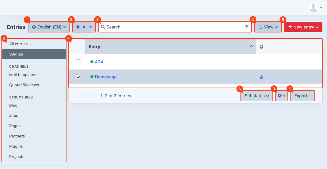
# Filter by status
(regarding image block 2)
You can apply filtering to display only the data of a certain status. For example, you can set a filter to only show all active pages.
Click on the button All. Various status filters appear in the dropdown menu. The options to choose are always different for each menu. Typically, green means live or active, orange is pending and red expired or discontinued. The transparent bullet shows pages that are disabled.
When you choose Drafts you get a view of all the items you are still editing. The Trashed option gives you a list of all deleted items.
Good to know is that you can also change the status in the detail page of an item. Furthermore, the name of the button always changes to the chosen, active status.
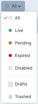
# Search & filtering
(regarding image block 3)
# Search
Use the search bar at the top of the page to search for certain keywords. This allows you to find a number of items (if they exist) where those words are used. Choose filter All to search through all available items.

# Filtering
While searching, it is also possible to set additional filters. This can be useful when, for example, you want to search specifically within a date range or particular author. This option can be found under the funnel symbol, displayed on the right side in the search bar.
Click on the Add a filter button, a list of possible filter options will now be displayed. Select a filter and click Apply.
It is possible to set multiple filters simultaneously.
When active, the funnel symbol turns dark gray.

# Sort & column view
(regarding image block 4)
# Sort
It is possible to sort column data by clicking the column title or with the button View along the right side of the search bar. This opens a window with two more buttons which gives you the ability to sort from small to large. With the help of Sort by you can also sort specifically by title, date, etc.

Sorting is active when the button is displayed dark grey.
Not all columns can be sorted by clicking on the column title.
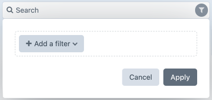
# Column view
The View button also takes you to the column view settings. Check which column you want to be shown on the overview page. The order of columns can be changed by grabbing the four dots and dragging the item to a different position.
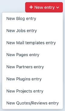
# Adding new content
(regarding image block 5)
At the top right of the page, you can add new content with the red button New entry. Clicking this creates a new item in the section where you were at the last moment. With the arrow on the right side of this button, you can directly create an item in another section without having to navigate to this location first.
# View center menu
(Regarding image block 6)
The organisation and view of the middle menu depends among other things on content. The developer creates a logical layout of the menu during the development of your website.
These adjustments can only be made by the developer of your website.
# Editing existing content
(regarding image block 7)
By clicking on the item title, you can edit the entry. More information on this subject can be found under chapter Entries.
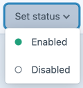
# Set status
(regarding image block 8)
The moment an item is checked on the overview page, the Set status button becomes active at the bottom right. This makes it possible to enable or disable one or more items simultaneously.
# Delete in bulk
(regarding image block 9)
The moment an item is checked on the overview page, a cogwheel will appear in the lower right corner. It is possible to delete one or more items at once. If you check one item, you also get the option to view or edit the item.
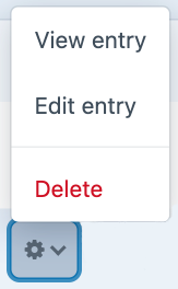
Depending on the selected item type, other kinds of options may appear.
# Export
(regarding image block 10)
The data from a view can be exported using the Export button at the bottom right of the page. This can be useful to make a backup or to import data into another system. Choose the export type and file format. If necessary you can enter a line count to limit the export. Click Export.
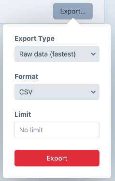
If you have a lot of content to export, it can be useful to limit the export to 10 lines. This way, you can quickly see if you'll get the expected result.