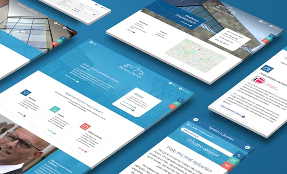
Janssen & Janssen - Corporate website
A debt collection agency with a personal character and a collaborative mentality? Those are not the first characteristics you might think of. That sparked our enormous enthusiasm for this great project! The challenge lay mainly in structuring and shaping the enormous amount of information. And that aimed at two very different target groups. We would like to tell you how we have tackled this.
The highlights of the Janssen & Janssen website
The Janssen & Janssen website is aimed at different types of visitors who want to be addressed in their 'own' way. Very important, of course, are the customers and - just as important - potential new customers. But in the case of Janssen & Janssen, the website is also frequently visited by the customer's customer; so the debtors.
Employer branding
Employer branding is also very important at this time. Because everyone is looking for the right person for the job. Clear, visual vacancies and clearly showing who you are as a company, of course, helps enormously.
On the Janssen & Janssen website, the visitor has the feeling of clicking through the website very naturally. This seemingly effortless navigation is based on a well-thought-out structure and content plan. We have a 'content first' approach at WHITE. We like to think first about what we want to tell, to whom and how we can present this as clearly and attractively as possible. We are not concerned here with the exact wording; we would like to leave that to the copywriter. However, we devise the entire structure of the website in advance.
Accessible and a personal touch
In the case of Janssen & Janssen, for example, we have made a clear separation between a part of the website for the customer (business) and a separate part for the customer's customer (payment). This is reflected, for example, in a clear separation in the menu. And although the entire website clearly forms one line in terms of presentation, you will see a more informative set-up in the 'payment' section. While in the 'business' part we focus more on accessibility and a personal touch. You can see that all content on the website has been carefully designed.
The website offers rich ways to present certain topics in all kinds of logical places. We immediately show which branches Janssen & Janssen focuses on and which services they offer. But the company also presents itself as a real knowledge partner with relevant news, interesting cases and white papers. In addition, training and education are offered. The office pages clearly display the contact details, but Janssen & Janssen also presents - without many words - as a large, national player.
As you read ... everything has been thought about.

Antoon Donkers - General Manager


